[Internet] My 5-minutes thoughts on Friendster
I had signed up for Friendster before but quickly deactivated my account because I had problem even responding to a friend invitation. Now that I have played with Yahoo 360, I thought I should give Friendster another try. Because I am a geek.
It's good that Friendster no longer requires an invitation to sign up, so I just "reopened" my account using the same email address. Upon login I noticed that my previous Friendster invitation was still valid, so I accepted that invitation. Yes, I was finally able to add a friend!
Here is a quick impression of Friendster, much of it is in comparison with Yahoo 360:
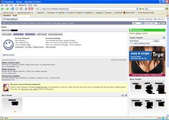
- Friendster displays way too many ads on every page! This is not scientific, but I feel that the two blocks of ads together occupy up to a quarter of the home page content.
- Friendster's UI is bland compared to that of Y360. Y360's layout just seems more logical and appealing to me. Friendster's ads probably have some ill-effects here as well.
- I like Friendster's horoscope feature. It's nothing useful, but a cute read nonetheless. I like innovations such as this.
- Friendster's free blog, powered by TypePad, is served with ads. Still, it looks clean and offers features such as categories. Y360's blog cannot compete. I got 50MB of space and 0.25GB of monthly bandwidth. I can upgrade to an ads-free version for a fee.
Friendster's omnipresent ads is the deal breaker for me. Yes, they have to make money, but the ads do occupy quite a lot of space. Besides, I just see more potential in Y360 since they have more services that could be integrated.
Update: Here is a picture of my Friendster page showing the ads.


<< Home